Regex Patterns for Single Line CSS
Posted on 29th August 2008 by Dan Rubin in internet |Uncategorized
ajax, bc, buddypress, canada, cheap, CMS, CSS, dialup, discounts, drupal, gadget, hosting, html, inexpensive, islandnet.com, joomla, mysql, news, perl, php, programming, python, reliable, rewards, seo, unlimited databases, unlimited email, v4, v5, victoria, wordpress, wp, xoops
Update: You can now download the Textmate macro file rather than recording your own (skip to the download »).
There has been plenty of discussion about the pros and cons of single-line style sheets, and I’ve been including them as an option when teaching CSS management and organization in my Web Design World presentations in Chicago, Seattle, and later this year in Las Vegas (at WebBuilder) and Boston.
It’s a matter of preference
As a fellow Sidebar–ian (Sidebarbarian?) Steve has been trying to convince me to use the single-line approach for a while of course, and Bryan and Jon have also become fans of this formatting style for their own work. Although they are enamored with it, I haven’t taken to it yet, still preferring to write my style sheets using the “normal” indented formatting most of us are used to.

Now, before anyone gets their knickers in a twist about why they love, hate, “can’t live without” or “will die before they try” single-line formatting, let’s just take a step back and remember one thing: it isn’t anything special, just an alternate formatting style that doesn’t affect the way the browser interprets the style sheet one iota. It’s a personal preference—remember that before jumping on or off this particular bandwagon.
Always keep your options open
Now that I’ve got that out of my system, let’s talk practicality: there are indeed benefits to be had when using single-line CSS formatting—for example, I find it can make a difference after a project has been completed, at which point I’m usually more interested in visually scanning a style sheet for the selectors first, and then for a particular property I’m interested in editing. This is where I’ve found single-line formatting can come in handy.
But my editor already does that!
This is the point where some people will start going on about how you could just use Textmate’s “foldings” feature to get the same visual result (without altering your file), or how CSS Edit has a handy list of all the selectors in a column on the left side of its window, or that you could always use your editor’s “find” command and search for the selector you want to edit. Yet while those are all perfectly logical, sane suggestions, they don’t account for flexibility and choice.
Just another way of doing things
Much like Jon Hicks with his harem of web browsers, I tend to be a bit of a “text editor polygamist”, bouncing from Textmate to CSS Edit to Coda to BBEdit to Transmit’s text editor and a host of CLI editors, mostly depending on my mood (though sometimes contextual if I’m at a computer that doesn’t have a particular application—a WindowsXP box with nothing but Notepad, for instance). It’s the times when I’m using an editor that doesn’t have “foldings” or pretty columns of selectors that I start to appreciate single-line CSS when making quick edits, so I’ve started converting style sheets to a “simple” single-line format (without the left-aligned tab blocks to start each rule’s properties) once they are ready to go live.
Patterns fit for a kilt
Editors like Textmate and BBEdit have built-in commands for formatting (the standard, multi-line approach) or compressing (the entire style sheet on one line, ostensibly to reduce file size by stripping white space) CSS, but no way to convert to single-line formatting and Textmate’s “Format CSS Compressed” bundle can format your stylesheet to a single line per-rule, though it’s all squished together, making it difficult to scan due to a lack of whitespace. Converting a style sheet by hand every time would be much too time-consuming to bother with, but that’s where regular expressions come to the rescue.
In Textmate, you can record a macro using each of these regex patterns as a separate step (I’m sure other editors have a similar feature, so please feel free to post details in the comments below). This allowed me to create a “Format CSS Single-line” command, complete with a keyboard shortcut, which enables an easy switch between multi– and single-line formatting.

Unfortunately, as of this writing Textmate macros cannot be exported and shared For those using Textmate, getting the macro is a simple matter of downloading, expanding and double-clicking this file:
While similar to “Format CSS Compressed”, this macro retains a single blank line where your original contained two or more blank lines (helpful if you group your rules), and adds whitespace that matches my standard formatting preferences (which I find makes it easier to scan quickly). To switch between each formatting style, just run each command in turn (via the Bundles menu or the keyboard shortcuts).
However, that wouldn’t be much use to everyone who doesn’t use Textmate, so here are the respective groups of regex I used for the conversion:
\n{3,}
\n\n

[ \t]+

(?m)([;:])\s+
$1

\s*}
 }

\s*{\s*
 {

[ \t]*,[ \t]*
,

@import(.*?);
@import$1;\n\n
What’s missing
In Textmate and BBEdit I can return to multi-line formatting with a single command, but that might not be as simple in other editors. What I’d love to see is a pair of shell scripts that convert from multi– to single-line and back, and possibly a web-based processor that does the same (paste your style sheet into a textarea, select your formatting, hit “process” and the script produces the result). If anyone would like to take on those tasks, I’ll happily update this post to link to the products of your labor.
And in the end…
If you’ve never tried single-line formatting, this makes it easy to experiment without committing yourself (and I do recommend giving it a try—you may be surprised once you’ve worked with it a few times).
Ultimately, because I can return to multi-line with a single command my primary text editor should I ever feel like it, automating the switch from multi– to single-line is a convenient way to get the benefits of single-line formatting without backing myself or my clients into a formatting corner.
Are Your Visitors Suffering From Widget Blindness?
Posted on 26th August 2008 by Glen in internet |Uncategorized
ajax, banners, bc, buddypress, canada, cheap, CMS, design, dialup, discounts, drupal, Features, gadget, hosting, html, inexpensive, islandnet.com, joomla, mysql, news, perl, php, programming, python, reliable, rewards, seo, unlimited databases, unlimited email, v4, v5, victoria, widget blindness, Widgets, wordpress, wp, xoops
Widgets are excellent for adding unique functionality to a web site. However, as the we becomes more “widgetized”, it’s starting to add strain on the web browsing experience for our users. The more widgets we add to our web pages, the worse it makes the web.
Widget Blindness
Banner blindness was discovered in the late nineties, and it shocked many people that users weren’t actually focusing on ads when a website was teeming with ad banners. Yet 10 years later, the problem isn’t so much with banners (that problem will always be around), but with web designers and site owners going out of control with adding widgets to their pages.
A widget for everything
These days you can find a widget for just about anything. Literally. It seems that every community website or interactive website has a goal to create widgets for their users, and users in turn place all of them on their blogs or personal websites.
In theory, widgets are awesome additions to websites. They add relevant information and showcase what the community or blog is doing. It’s not like a stale ‘ol banner asking you to hit a target for a prize. However, the problem doesn’t lie with the widget makers. The problem lies with website owners who try to add too many to their layouts. Just like banner blindness, users are starting to not notice widgets. And even worse: Widget blindness might even turn visitors away from your site.
6 Reasons widgets are worse than banners
The negative effects of adding too many widgets to your layouts and pages can have an even worse effect than banners for multiple reason.
1. Slow loading pages
Typically banners are a fraction of the size of widgets. Depending on the type of banner you’re using, they’re typically smaller than the average widget. usually jpegs or animated gifs, and some like adsense use small javascript. Widgets on the other hand typically use larger javascript files or flash.
2. It only takes one bad widget…
While widgets will slow down the rendering of the page in the browser, a slow or unresponsive widget can drastically increase the page load time, if it even finishes loading at all. Popular blog TechCrunch had to remove widgets due to them crashing the site.
It only takes one unresponsive widget to bring a site to its knees. The more widgets you have on your site, the more places you rely on to keep your site’s speed and response times fast.
3. Widgets take attention away from the most important part: Content
You need to ask yourself a fundamental question: Why are users coming to your Web site? Is it because of the widgets in your sidebar? Hopefully, users are coming to your site because of the stellar content.
Content is still king on the web. However, when page has 28 widgets in the layout all begging for your attention, it takes the user’s focus away from the hard-worked content and places it on content that someone else has created.
4. They take up ad space
Most site owners want a part of their layout to be designated for ads. If you’re trying to sell ads, the best spots are above the fold. If you’ve got widgets everywhere, you’re taking up crucial ad space. There is only so much space in your layout that you can devote to things other than your content. Adding a bunch of widgets to your pages only makes less space for the ads that make you money.
5. They can frustrate users
If the page doesn’t load quickly (or at all), and is crowded with cheesy widgets, the user will be prone to leave the site quickly. Unappealing site designs add to the user experience, and bad experiences can turn users away. Overcrowding a site with widgets is an easy way to add to a negative site experience for a visitor.
6. Does anyone still look at them?!
Now that the initial hype of widgets has died down, there seems to be less interest in people looking at widgets. When MyBlogLog rose to popularity and were acquired by Yahoo!, it seemed that people couldn’t get enough of widgets. Now that nearly every online community or similar website offers widgets to their users, the space has become crowded and widgets are everywhere. People have developed widget blindness.
Note: The excitement certainly hasn’t died down for widget makers and web developers. Just the people use them on the web sites.
Widget self-control
There is a temptation to add every widget you come across to your website. There are plenty of great widgets out there, and the possibilities are endless.
So how do we know how many widgets are too many? That’s ultimately a personal decision, based on the type of site you have and how your audience interacts with your site. Widgets can be great compliments to your site. There is one hard-and-fast rule that I use when deciding whether or not to add or remove a widget on any of my sites.
As long as the widget is improving the user’s experience, keep it. Otherwise dump any widgets that don’t achieve that goal.
This method usually separates the separates the wheat from the chaff. The widgets have to “prove themselves” before they can stay on the site.
You can be very critical when deciding what stays and goes. Always remove the widget if you’re wavering between keeping or dropping it. If it’s not instantly clear as to why it’s still on your website, the widget probably isn’t worth it.
Behind The Scenes Of Exquisite Web Typography – Part Five
Posted on 25th August 2008 by Vivien in internet |Uncategorized
ajax, bc, buddypress, canada, cheap, CMS, dialup, discounts, drupal, gadget, hosting, html, inexpensive, inspiration, islandnet.com, joomla, mysql, news, perl, php, programming, python, reliable, rewards, seo, typography, unlimited databases, unlimited email, v4, v5, victoria, wordpress, wp, xoops
I don’t remember how I came across Codex Transportica, except that it happened very late into the night and I was about to shut down my computer, but one click of a button, one look at that site made me spend another hour or so online. Two things came to my mind almost simultaneously: I’d love to feature this site in my Behind The Scenes Of Exquisite Web Typography series and what kind of a sci-fi fan am I if I’ve never heard of the book The Codex Transportica before. So I did a quick search on Google and the only other sites that mentioned this book were linking back to that same Codex Transportica blog.

In order to ensure my sanity, after reading a couple of blog articles and checking out the futuristic vehicle drawings and comments, I filled out the contact form and hoped that soon someone will get back to me with the answers to my questions about the history behind the Codex Transportica, its designer(s), illustrator(s) and writer(s).
What is true?
Here’s the true story about the mysterious ‘book’ and its creators straight from the horse’s mouth.

Nick Pearson loves to doodle, and was playing with an idea of drawing some strange looking vehicles and posting them online. He did some brainstorming with the fellow members of the DonationCoder forum and the project Codex Transportica came to life.
“To keep things as flexible as possible the ‘book’ was going to require translation—thereby allowing us to write things that we could then contradict later on if we didn’t like it—we could simply say it was a bad translation first time around.”
Later on Tim Smith came on board and the two of them formed a perfect team of a designer and a writer. Nick draws a vehicle, passes the illustration over to Tim who then devises a pretty plausible description of the futuristic machine.
When is it OK to use Times New Roman?
Nick Pearson is also responsible for the design of the site. The type choice (ubiquitous Times New Roman), justified text, the gradient of the paper-like background, hand-drawn figures and icons, striking Victorian wallpaper and the gorgeous header make the site resemble a book.
Times New Roman was criticized by some as an unsuitable typeface for online reading (opting for Georgia or other faces instead). But with the right type treatment it’s possible to bring out the best of the good old Times New Roman. Two of the most effective techniques to give a non-typical look to any typeface is to experiment with leading, achieved by line-height in CSS, and white space in the form of letter-spacing in CSS.
That’s exactly how Nick Pearson made the content of his site legible and unstrained for reading online: he kept the body text at the default size of 16px but added a generous line-height of 26px. In addition he restrained the content area to 434px wide, which keeps the line lengths to the optimal 60-70 characters long.
In fact, Nick sticks to Times New Roman throughout the entire HTML copy of the site: menu links, navigational post links, article titles, comments. And everywhere Times New Roman looks different thanks to varying font sizes, letter-spacing, font-weight and colours.

How to add some authenticity to the site?
The first thing that catches the eye on Codex Transportica site is the opulent header image that resembles an antique red leather cover of the ‘book’ with the washed out embossed gold lettering and the ‘worn out’ dark patches.

Nick has re-created the ravishing ornate letters C and T from a book called “Alphabets”, published by L’Aventurine. I’ll try to get myself a copy of this book filled with stunningly drawn alphabets, which are all copyright free.
For Codex Transportica Nick has chosen the monograms designed by a 19th century German designer Karl Klimsch. I managed to locate one of his books with 2,100 Victorian Monograms on Google Books so that you could take a closer look at the amazing work by Karl Klimsch.

I also ordered a copy of this book from the local book store and will share some designs with you on Inspiration Bit as soon as the book arrives.
The lowercase letters in Codex Transportica are displayed in Birch Std that goes really well with the ornate capital letters.
All the other text in the header is displayed in a familiar Courier New, which adds authenticity to the whole mysterious ‘book’ experience on this site. I’m also very fond of the beautiful grey background wallpaper that somehow reminds me of Rudyard Kipling. I guess because of some Indian/British influence that I see in the background pictures. I asked Nick to tell me a bit more about the wallpaper:
The background to the website is a tile I managed to put together from a bad photograph of real Victorian wallpaper (I think it is Victorian).
The drawings and the writing, which is composed not without a good sense of humour, deserve a special attention. I highly recommend you to carve a bit of time for yourself to sit down and read a few chapters of Codex Transportica. You’ll get transported to a very strange future that at times feels like the society went backwards in its development, and other times you’d be left in awe at what could be possible to accomplish had the science learn the way to transform one’s phenomenal imagination into reality.
What can be improved on Codex Transportica?
Even Nick considers his site to be a “beta” and will be tweaking it as the time permits, so I’ll try offering some constructive criticism here and encourage you to do the same in the comments below.
Although I commend Nick’s decision to stick to Times New Roman throughout the HTML text of the site, I’m not crazy about the menu titles at the top, they look like typical Times New Roman on sites dated back in the 20th century. I actually tried displaying them without the added weight:bold, and to me that made the menu links look better.
Some of the book chapters list other related topics at the bottom of the article, currently they are displayed in exactly the same font style and size as the main copy of the site. I would like to see a different type treatment for those links that would allow them to standout and cause less confusion to the site’s readers.
Hopefully Nick will pay more attention to styling the comment and contact forms on the site. Right now they show up with a standard HTML treatment, default font sizes, colours and styles, and look unattended. I’d like to see them equipped with a style suitable for this blog.
I studied some underlying code of the site and it definitely needs to be cleaned out here and there: there are occasional nested divs with some redundant styling applied to them.
I do like though a few interesting programming goodies on the site, like the icon/link for displaying Random Posts on the blog, the links to the latest and oldest articles, as well as the previous and next ones, and the mobile version of the site.
What are your thoughts, suggestions for the Codex Transportica? If you’ve missed my previous articles in Exquisite Web Typography series, be sure to check the past issues: Part One, Part Two, Part Three and Part Four.
VOTE: I Want Your Opinions
Posted on 21st August 2008 by Lindsey in internet |Uncategorized
ajax, Articles, bc, buddypress, canada, cheap, CMS, CSS, cssgirl, design, dialup, discounts, drupal, gadget, General, hosting, html, inexpensive, islandnet.com, joomla, mysql, news, perl, php, programming, python, reliable, rewards, seo, unlimited databases, unlimited email, v4, v5, victoria, vote on design, web design, website mockup, wordpress, wp, xoops
In the beginning of 2006 I launched CSSgirl. I moved all the content from my old site (triplelproductions.com) and started CSSgirl Designs with a brand new design. Over time I’ve changed the design a bit, adding and removing sections, images and content.
Since last summer I’ve been planning a redesign, but I just can’t settle on one that I am happy with. So, I would like to have some feedback from the people who visit my site- who see it regularly!
I have four designs that I’ve created that I am deciding between. View them and let me know your opinions – good or bad! Two have already been coded, two are just image mockups:
Vote for your favorite:
(PS: If you vote for “something else entirely”, let me know WHY. otherwise I’m going to remove that choice because I won’t know which direction people are looking for! Your comments won’t hurt my feelings, I promise!)
Note: There is a poll embedded within this post, please visit the site to participate in this post’s poll.
Voting ends September 1st, 2008.
The three designs I do not choose will be converted into free WordPress themes (and Movable Type too, if I find the time!)
Please leave comments with suggestions, criticisms, etc!
Simple CSS Hover Tab Thingy
Posted on 19th August 2008 by Dan Rubin in internet |Uncategorized
ajax, bc, buddypress, canada, cheap, CMS, CSS, dialup, discounts, drupal, gadget, hosting, html, inexpensive, islandnet.com, joomla, mysql, news, perl, php, programming, python, reliable, rewards, seo, unlimited databases, unlimited email, v4, v5, victoria, wordpress, wp, xoops
Update: The original edit of this post and demo file didn’t quite work in IE6/7 (ok, didn’t work at all, really). That’s what you get when you rush and/or don’t care about certain browsers See the comments for my quick explanation of the fix (the demo now works in FF2/3, Safari 2/3, Opera 9, and IE6/7).
Ok, so the name won’t win any awards, but let’s be honest: neither will this mini-tutorial, or the idea itself (nothing groundbreaking here, move along…). But after throwing together a quick little (you guessed it) hover/tab/thingy for my previous article, I thought I was fun enough to share, in case you find a need for it someday.
The usual suspects
The “thingy” in question is just a simple unordered list, with each list item containing an anchor and an image—we want the images in this case because I want them to display in my RSS feed and for anyone who can’t (or chooses not to) view the styled version of this site.
Note: Feel free to reference images in the stylesheet rather than inline if that suits your purposes. Because I know you need permission, don’t you…
If you were too lazy to click the link to my previous article above (and who could blame you, really), here’s a quick demo page.
Moving right along…
First, the markup (with URLs truncated to save trees):
Simple, uncluttered, uncomplicated. Just how I know you like it.
Next, the CSS—not quite as short as the markup, but that’s how the story often goes:
1
2
3
4
5
6
7
8
9
10
11
12
13
14
15
16
17
18
19
20
21
22
23
24
25
26
27
28
29
30
31
32
33
34
35
36
37
38
39
40
|
ul#hover-tab-thingy {
  position:relative;
  padding:0;
  width:500px;
  height:498px; }
#hover-tab-thingy li {
  float:left;
  list-style:none; }
#hover-tab-thingy li a {
  float:left;
  padding:9px 21px;
  background-color:#eee;
  color:#999;
  font-size:9px;
  text-align:center;
  text-transform:uppercase;
  border-right:1px solid #fff; }
#hover-tab-thingy li a:hover {
  background-color:#f60;
  color:#fff; }
li#one a,
li#one a:hover {
  background-color:#e5e5e5;
  color:#555; }
#hover-tab-thingy li a img {
  position:absolute;
  left:0;
  top:30px;
  width:500px;
  height:460px;
  clear:left;
  margin-left:-9999px;
  padding:1px;
  border:3px solid #e5e5e5; }
li#one a img,
#hover-tab-thingy li a:hover img {
  margin-left:0; }
li#two a:hover img,
li#three a:hover img {
  border-color:#f60; }
|
This is all fairly straightforward, so here are the highlights that may help when duplicating this on your own:
- The entire idea is that you have tabs that are each associated with content (images in this case) which are made visible when the user hovers over the tab. There are more things you could do with this, but that’s your job, grasshopper.
- The tabs are floated; the content elements (
img in this case) clear the floats.
- The content elements are set to
position:absolute, so they can appear in the same location for each tab. To accomplish this, the ul is set to position:relative (in short: an absolutely positioned element will be positioned relative to its nearest positioned ancestor—see Doug Bowman’s great write up for more), and it’s probably a good idea if the dimensions of your ul (the container for your content) have a lot in common with those of your content elements.
- IE6 has a problem reverting elements that set
display:block on :hover to their original state (e.g. display:none). To counter this, use a negative left margin as the default positioning, and then set margin-left:0; on the hover state, which works in all modern browsers.
- The
width and height is specific to my example (the dimensions of the images I used), ditto for the padding on the tabs and the top positioning on the img elements (to push them below the tabs). Bend them to your will.
- Everyone dies at the end of The Departed. Seriously, everyone. That should be the subtitle of the movie.
Obligatory wrap-up
This may be something that you’ll find use for on a regular basis—one of those tiny snippets of reusable “stuff” that you’ll be glad you don’t have to type every time. Or you’ll never need it because you can’t for the life of you think of any reason why you’d need to reveal some content whilst hovering over a tab (I’m pretty much just painting the sarcasm with a roller at this point…).
Whatever your future may hold, now you have something you might not have had before, and that’s never a bad thing—unless we’re talking about some sort of disease, in which case…
I Need Some Spacing
Posted on 19th August 2008 by Dan Rubin in internet |Uncategorized
ajax, bc, buddypress, canada, cheap, CMS, design, dialup, discounts, drupal, gadget, hosting, html, inexpensive, islandnet.com, joomla, mysql, news, perl, php, programming, python, reliable, rewards, seo, unlimited databases, unlimited email, v4, v5, victoria, wordpress, wp, xoops
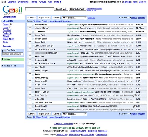
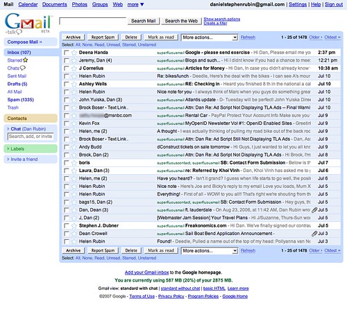
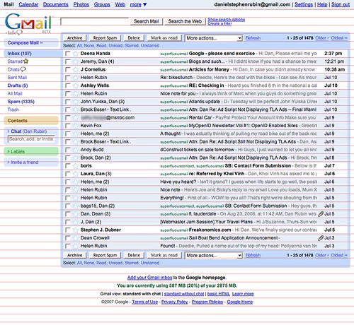
Way back in June over on Subtraction, Khoi presented a tweaked version of the Gmail interface (and then a follow-up article regarding the feedback on the first), improving spacing and alignment by making a few small but significant changes overall:
“…by normalizing the space between like elements, aligning elements along similar spatial planes, moderately increasing the space between stacked items and paying attention to how elements are framed by negative space, we can get what is, in my opinion, a significantly more attractive Gmail interface.” —Khoi Vinh
This is something I’ve wanted to see for a while in Gmail, and in fact had presented a few examples last year (July 2007) as part of my interview process at Google (I really must write about my series of amazing job interviews last summer, but I’ll leave that for another time). After reading—and commenting—on Khoi’s post, I had intended to publish my variation on Google’s mid-2007 interface, but as the dedication to blogging continues to elude me, this too fell a few pages back in the Moleskine to-do list—until now.
The Setup
I took a slightly different approach than Khoi, though my goals were similar:
- Give all elements more room to breathe
- Make it easier to target navigation and oft-used links
- Normalize alignment of text and other elements
- Do it all without drastically altering the appearance of the interface
That last goal was important and acted as a guide to the rest: I wanted to present improvements that could be made right away without causing a negative reaction among Gmail users.
Rather than adjust the line height of the main message area, I decided to bring as many of the other elements in line with that as I could. You’ll notice spacing improvements within each line however, reclaiming some poorly used horizontal space. Like Khoi, I felt the message lines were a bit crowded, so to give the impression of more room in those lines, I removed the grey horizontal lines between each item and allowed the background color to bleed through (all they need is some separation—further emphasis on those lines just adds weight). The result is that it feels like there’s a bit more space, without actually adding any.
The main navigation lost its underlines (again, removing unnecessary visual weight—the “this is a link” cue is superfluous here) and gained space (matching the baseline of the message list). The “Compose Mail” link got an extra highlight by way of a background; the extra padding makes it the only navigation item that doesn’t align with the baseline, but that also gives it a little more contrast vertically, thus it stands out more without having to scream for attention. Less important text links within the message area were made slightly smaller (but kept their underlines), and “Mark as read” was pulled out of the drop-down menu and given its own button: I had spent a week or so watching people use Gmail before doing this exercise, and that was the second most frequent action users needed (right behind “Delete”) but was hidden in the drop-down.
Finally, all rounded corners were cleaned up a bit, footer text was aligned to the baseline, and the message list was enclosed on the right side (maybe it’s just me, but it’s always bugged me how those lines just run right to the edge).
Reveal Already!
I’m still happy with how this turned out a year later, and it was well received by the Google interview crew. Compare the before and after images, and you’ll also notice that the improved spacing in this example actually reduces the overall height of the page, allowing two additional message lines to fit in the space of the original.
Both Khoi’s and my realign leave almost all the original elements of the interface intact—this is very important when making changes (even if only suggested ones) to such a popular application, and the same goes for any product, publication or web site that is part of a person’s daily routine.
Whether Gmail incorporates any of these suggestions is out of our hands, but it’s still nice to have the chance to compare.
Note: many changes have already been made to the Gmail interface over the last year, and even in the last few months since Khoi posted his example. Not all are improvements, but at least someone’s making an attempt.
My Love Affair With Woopra
Posted on 19th August 2008 by Lindsey in internet |Uncategorized
ajax, analytics, Articles, bc, buddypress, canada, cheap, CMS, dialup, discounts, drupal, free web stats, free web tracking, gadget, google analytics, hosting, html, inexpensive, islandnet.com, joomla, live visitor tracking, live web tracking, live website statistics, mysql, news, perl, php, programming, python, reliable, resources, rewards, seo, unlimited databases, unlimited email, v4, v5, victoria, visitor tracking, Web analytics, Web Tools, Web Tools/Apps, website statistics, website stats, website tracking, Woopra, Woopra live tracking, Woopra reivew, wordpress, wp, xoops
I love looking at the analytics for my site. I love seeing what articles are most popular, what people land on the most, where they come from and where they leave.
A few months ago I learned about Woopra – a free tracking/analytics program that has a beautiful gui and some pretty freakin’ cool features.

What is Woopra exactly? From their site (bolds are from me):
Woopra is the world’s most comprehensive, information rich, easy to use, real-time Web tracking and analysis application. And it’s free!
When you sign up for a free Woopra account you give them the urls you would like to install/use Woopra on. In turn (after your site is approved) you are provided with a little javascript code to place on your site so that Woopra can track your visitors. You will also need to download the Woopra desktop client. From there you can start live tracking all your visitors. Oh, yeah, and they just released a new WordPress plugin that integrates their analytics right in your WP Admin. Sweet!
Woopra will track every visit and record important information for you – browser, OS, screen resolution, referral, etc. Ok, so not much different than all the other analytic tools out there right? But Woopra offers a really cool live tracking feature which allows you to see exactly who’s on your site at that very moment.
For each person who visits your site Woopra tracks their actions, and than stores them so that you can lookup that person’s history on your site. The live feature also allows you to “start a conversation” with any visitors currently on your site. I haven’t tried that feature yet – I think it’s kinda weird to interrupt someone browsing my site, but I find it interesting and in some situations I can actually see it working as a helpful interactive feature.
A breakdown of Woopra

Click to enlarge
The live feature really is the kicker for me, but the analytics Woopra offers shouldn’t be forgotten either – the top of the application features a line graph representing your pageviews and visits for that day. You can also switch the graph to show visits for that day VS the average visits, today’s pageviews VS the average amount of pageviews or have the numerical value of live visitors show.
The next level shows a component on the left with a breakdown of visits and pageviews for the previous month. You can also toggle this component to show your hourly overview instead. To the right of this component is your content breakdown – listing your pages that are being visited and the total landing, total exits, total pageviews and average time spent on each page.
Below those two components are three more – the first of the three being my favorite – a list of referrers – and the time people landed on your site via those referrals. The list is linked so you can click on these referrers and via your browser be directed to the page your visitor was sent from.
On this component there are three toggles – the first allows you to display a pie-type graph that represents the sources from where your visitors are coming from. Letting your mouse hover over one of these colored area displays the exact percentage of users from that source, the exact amount of links from that source and also highlights the corresponding name of the source in a list to the right.
The second toggle s your “top” sources of traffic (for that day mind you) and how many hits were delivered via that source. The third toggle is what I had mentioned first – the list of all your referrers with a link to where your visitor came from.
The second component is for search information – you can toggle this by keywords – which is displayed in a slick tag cloud-ish format. The second toggle allows you to display the exact search phrases that led visitors to your site (plud which engine they were directed from and the time).
The last component is geared toward visitor information. The first toggle, loyalty, allows you to see how many visitors for that day were “loyal” (returning) and how many were new visitors. Hovering over the pie chart gives you the same breakdown as the sources chart – returning a percentage and exact number of visitors.
The second toggle, countries, provides you with a list of countries and the breakdown of how many visitors were received from each.
The last toggle, map, gives you a visual breakdown of where these users are from – the hottest spots are marked in yellow, others are marked in a light blueish town. Hovering over a country/region will display the countries name, flag and a number of visitors you received from that country.
Woopra’s Live Visitor Analytics

Click to enlarge
And that’s not it. To the left of the components is a menu that allows to get even deeper into your analytics. The first button takes your to the dashboard, which I explained above. The second and my favorite, “Live”, shows you all of your live users and where they are currently on your site. If Woopra recorded a referrer for that site, it’s listed, along with the time of arrival. There is a breakdown of specs (browser, ip location, resolution, OS, country, language and so forth), and then it tracks -live- ever page that the visitor goes through. (It also marks any extrernal links that the user has clicked on).
At the bottom it gives even more details – total visits for that user, total pageviews, the average pageview for each visit, total time spent and average time spent.
Each user is assigned an ID (I assume based on IP), and you can view their history for each time they have visited (how they got there and what they did when they were on your site).
In the live section is where you can start a conversation with any live user on your site. One last option “tag this visitor” allows you to assign a tag to that visitor – so for example you can name yourself – maybe any visitors you know that visit regularly and you have an idea of what their IP is, or other people who work on your site with you.
Aside from the visitor specific goodies, to the left of that is a map – which pinpoints locations on the map of live users. You can also sort these live users by all of the above mentioned characteristics.
One last thing you can do is search for users – and you can search by any query – brower, country, platform, etc.
All the rest…
There are so many great features to Woopra, without making this into a book I’m going to have to lightly go over them. The final menu items are Search (display your search results and allows you to search anything), Analytics (standard analytic goodies – pretty much a more comprehensive breakdown of what you see on your dashboard with more sorting/filtering options) and Manage – which allows you to create notifications for a variety of things (if a certain visitor goes to your site, or if a page is landed on or you receive a referral from a url you define) and has a “custom live map” – which I haven’t messed with so I can’t give an accurate breakdown just yet.
The Scrolling Data
One last cool feature Woopra provides is at the very bottom of the application is a scrolling marquee of all data and where you stand for that day in regards to averages (ex: total pageviews are down, but pageviews per visit is up by 1%).
My love affair will continue
I’ve pretty much forsaken Google Analytics for Woopra – mind you I’m not a hard core stats fanatic. I just like seeing the numbers. Most of the more advanced features of Google Analytics I bypass because I either don’t understand them, or I don’t need them. Woopra is open 24/7 on whatever computer I’m on, but I find myself only checking in about 1-2 times a day now that I’ve gotten over the initial puppy love.
Woopra isn’t perfect by any means – before they released Woopra 1.2 (August 10th) I had found it to be a little buggy – for example I would get disconnected and I would have to end the Woopra process in order to get it to reconnect. That’s been fixed now with the latest release.
So is Woopra right for the hard core stats whore? Maybe – but if you’re looking for an easy way to track your visitors and get a nice visual representation that Woopra will work well for you. Woopra lets you track multiple sites – not sure what the limit is, but I currently am tracking six.
To note: “Woopra is free of charge during the Beta testing phase. Both free and paid plans will be available as soon as Woopra is officially released. Enterprise editions for commercial, high traffic sites, will also be available.”
Update 8/21/08: Opened up my Woopra this morning to find my main site missing (cssgirl.com) and the rest of my sites aren’t tracking at all. So sad. I’m not using the WordPress plugin, which many people have been having problems with apparently. Also, in my member’s area, the API key for my site cssgirl has gone away and only says “null”.
Sent an email via their contact form at 9am. Left two messages (seems to be a widespread problem) on the forum. Will wait and see how this plays out.
I’m going into stats withdrawal.
Update 8/21 #2: CSSgirl is back (along with my other sites- well all but one) and tracking! Happy days.
Augmented Reality iPhone, Tiny Eyes, Time Perception, My Drive Thru & Air Ape
Posted on 14th August 2008 by Mike Bennett in internet |Uncategorized
ajax, art, bc, brain, buddypress, canada, cheap, CMS, dialup, discounts, drupal, gadget, General, HCI, hosting, html, inexpensive, islandnet.com, joomla, Link Bucket, mysql, news, perception, perl, php, programming, Psychology, python, reliable, rewards, see, seo, unlimited databases, unlimited email, v4, v5, victoria, vision, wordpress, wp, xoops
All the world is aflame with the iPhone! Have a look at this example of the iPhone used as an Augmented Reality device. (thanks Karl)
See how the world looks to a baby’s eyes.
What is our psychology of time? Read The future is nonlinear on Mind Hacks to learn more.
Drool drool love the visual style in the My Drive Thru music video.
Air Ape art.
IE6 PNG Fixes – SuperSleight & Unit PNG Fix
Posted on 9th August 2008 by Lindsey in internet |Uncategorized
ajax, Articles, bc, buddypress, canada, cheap, CMS, CSS, dialup, discounts, drupal, gadget, hosting, html, IE PNG, ie6, IE6 PNG Support, inexpensive, internet explorer, islandnet.com, Javascript PNG, joomla, mysql, news, perl, php, PNG, PNG Transparency IE6, programming, python, reliable, resources, rewards, seo, SuperSleight, Unit Interactive, Unit PNG Fix, unlimited databases, unlimited email, v4, v5, victoria, web design, Web Tools/Apps, wordpress, wp, xoops
 A few weeks ago a new javascript, Unit PNG Fix, was released by Unit Interactive for an IE6 and below PNG support fix. Up until now I have been using SuperSleight with no issues. So I decided to do a little research this morning to find out what made Unit’s Interactive PNG fix better than good old SuperSleight.
At first glance Unit PNG Fix has the benefit of being smaller (1k .js file, 1 transparent .gif). SuperSleight has a total of 3 files (two .js files and (one 3k, the other 2k, and the transparent .gif), but you can choose to use either one of the SuperSleight .js files – so if you prefer to use the mini version of SuperSleight it would just be 2k.
Both are called the same way in the of the document – a conditional focusing on IE6 and below.
Unit Interactive lists the benefits of it’s script as:
- Very compact javascript: Under 1kb!
- Fixes some interactivity problems caused by IE’s filter attribute.
- Works on img objects and background-image attributes.
- Runs automatically. You don’t have to define classes or call functions.
- Allows for auto width and auto height elements.
- Super simple to deploy.
24 ways introduced SuperSleight as having the following qualities:
- Works with both inline and background images, replacing the need for both sleight and bgsleight
- Will automatically apply
position: relative to links and form fields if they don’t already have position set. (Can be disabled.)
- Can be run on the entire document, or just a selected part where you know the PNGs are. This is better for performance.
- Detects background images set to
no-repeat and sets the scaleMode to crop rather than scale.
- Can be re-applied by any other JavaScript in the page – useful if new content has been loaded by an Ajax request.
After creating a few png transparent images and testing both methods here are my pros and cons of each:
SuperSleight
PROS:
- No need to edit .js files with image link when both are placed in the same directory (ie: root).
- Plug and play – just upload the supersleight-min.js and x.gif to your root directory, plug in the link to the file in an IE conditional and it works.
-
CONS:
- Get IE warning about “blocked content”. Need to click top warning popup to activate supersleight.
- Comes packed with two .js files: supersleight.js and supersleight-min.js. Could be confusing to a lay-person as to which file to use, and if both are needed.
- Loads slightly slow. On pages with multiple PNGs in IE6 you see a “gray flash” before the PNG fix kicks in.
Unit PNG Fix
PROS:
- Smaller size. But only by 1k.
- No popup warning that their is active content.
- Seems to load multiple images faster than superselight. A page with about 20+ transparent pngs loaded almost instantly without the “gray flash” commonly seen before the js kicks in for IE6.
CONS:
- Comes with the path to the clear.gif image linked in the /images folder.
So overall, I have come to the conclusion that it seems Unit Interactive’s Unit PNG Fix is indeed a better alternative to good old SuperSleight. Let’s just keep hoping that user will keep updating their IE6′s until there is virtually no one using IE6.
Typography Essentials – Free Fonts, Tools and Tutorials
Posted on 3rd August 2008 by Lindsey in internet |Uncategorized
ajax, Articles, bc, buddypress, canada, cheap, CMS, create a font, dialup, discounts, drupal, font, Fonts, free fonts, gadget, hosting, html, inexpensive, islandnet.com, joomla, mysql, news, perl, photoshop, php, programming, python, reliable, resources, rewards, seo, type, typography, typography on web, typography tutorials, typopgraphy tools, unlimited databases, unlimited email, v4, v5, victoria, web design, wordpress, wp, xoops
Another important aspect in web design (combined with the right color combinations and Photoshop essentials and brushes) is getting just the right typography for your design. There are many, many free fonts available as well as tools to build your own. Not only that but you can use free online resources to determine the name of that elusive font you’ve seen used elsewhere and want to grab it for yourself.
Once you find the font perfect for your project then you have to know how to use it. While some of the best resources about learning more about typography are books (Thinking with Type and The Elements of Typographic Style are two of my favorites) there are tons of online articles and tutorials written by people in the design industry that will help you better your typography.
Identifying a Font
Don’t you hate it when you’re to work on a project where you don’t have access to the original design files, and the client doesn’t know the name of the font in their logo? No worries, these sites will help you find that font!
 WhatTheFont – is a search engine that allows you to upload or link to an image and it will bring up results for you of several similar fonts so you can compare and match. For example I linked to the new search engine cuil‘s logo. I went through the process of refining the search (adding the characters isolated to each letter in the images) and was presented with a list of 30 possible matches. Part way down I determined that the font was Myriad Pro-Black – as you can see the image you upload scrolls the page with you for easy matching.
Font Lover – is a livejournal community that allows people to discuss various aspects of fonts and typography and it’s highly knowledgable font obsessed following can help you define fonts you’ve seen and find a similiar or the exact font used. Just upload a good quality image of the font you are looking for and they will have at it!

Identifont – this site allows you to answer a series of questions and it will try to narrow your results by process of elimination. I went through the Q & A to see how well it did, using Trebuchet MS as my “answer”. To be “serious” about this test I used a small sample of text (two long sentences) and answered the questions as applied only to that sample. So if it asked about an upper case “J” which wasn’t present- as well as any other unpresent letters – I clicked the “not sure” answer. (In a lot of cases you will have very little character samples to go with). After answering all the questions I was given the font “Alwyn” as the most possible answer. Out of the total of 7 fonts, Trebuchet MS was not present. I’m sure this site may work for others, but from my simple test I didn’t receive very reliable results. (Alwyn and Trebuchet MS are not that similar!)
Free Fonts
Finding the perfect font for your project can be a headache with so many choices available. Thankfully these services allow you to browse by the fonts characteristics aiding your search for the perfect font.
 1001 Free Fonts – one of my favorite font sites since day one of my foray into design. They offer free fonts categorized by category (“Brush”, “Western”, “3D”, etc) and you cna browse alphabetically. You can also search for a font by name (should you know it). I’m not sure what their total number of fonts are, but they had “1001″ back in 1998 when they launched, so I’m guessing it may be a bit larger now! The only unfortuante thing is that they are constantly trying to sell you the “Ultimate Font Pack” or commercial fonts for sale.
Dafont – offers categories and subcategories to browse by, latest fonts, top fonts, search and alphabetical listings and brags that they have 8031 fonts (and growing!). You can preview the font by entering you own sample text as well as adjusting the approximate size (tiny, small, medium, large). Also allows comments on the fonts by other users.
SimpletheBest Free Fonts – is another site just like 1001 Free Fonts and dafont, but offers a little twist – the font preview is in color and also includes a very brief description (informative stuff like if the font is only lower case of it it includes international symbolds, etc).
Fontleech – was a blog that updated sporatically from 2005-2007 linking to various free fonts all over the internet of very high qualities. I’d definitely recommend browsing through the archives and finding some new favorites.
 40+ Excellent Free Fonts for Professional Design – Smashing Magazine put this list together in 2007 of over 40 great font that you can use for free in your professional work, where I found one of my favorite fonts Anivers*. Smashing Magazine also provides a great series called Free Fonts of the Month, linking you directly to the months best free fonts!
Typography Tutorials and Articles
You found the found you need for your project… now you’ll need some inspiration and direction on how to use it!
I Love Typography – Comprehensive site dedicated to typography. Publishes articles on font finds, history of fonts and typographical styles and so much more. Definitely worth an add to your RSS feed collection.
 Super Cool Frilly Bits Typography – Abuzeedo.com provides a fantastic tutorial on how they added frills to match their logo with a grunge like background.
 40 Killer Typographic Posters, Photoshop Effects and Tutorials – Typography by example. 40 amazing, beautiful, stunning and “killer” examples for you to learn and drawn inspiration from.
Typography Matters – A List Apart contributor Erin Kissane explains about an often overlooked item of online typography – typographically correct punctuation.
Down With Helvetica: Design Your Own Font – The New York Times has a decent article about how more and more people are turning away from readily available free and commercial fonts and creating their own.
50+ Fonts for Big, Bold Headlines – A great list of FREE fonts available for download that will help you construct that perfect headline that pops out grabbing readers.
Web Style Guide – Everything you will ever need to know about typography on the web.
5 Simple Steps to Better Typography – Mark Boulton provides a series of five articles explaining five very simple things you can do to achieve better typography. This is the first of the series, before the comments is the links to the other four “chapters”.
Better CSS Font Stacks – Nathan of Unit Interactive has written a great article that no CSS coder/designer should miss out on. He explain how we can easily make better “font stacks” (a.k.a – the list of fonts that the browser should display for elements).
8 Fonts You Probably Don’t Use In CSS But Should – Tahoma lover? Century Gothic fan? Here’s your lead-in to start using your favorites in your CSS.
Typography Tools
Can’t find the perfect font? Create your own!
FontStruct – Design and create your very own font family – free!
How To Create Your Own Font(s) – I Love Typography brings you an fantastic article on how you can make your own font and the tools your need to start.