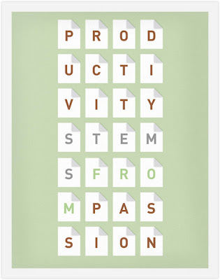


Missouri-based designer, Frank Chimero, has created a series of posters to inspire other designers. There are just a few of my favorites from the series. Wanna be inspired every day? They’re for sale right here. |DBK
Words of Inspiration
Comments Off
Busting the myths: what Graphic Design ISN’T
Comments Off
For a bit of fun I’ve put together a list of things that Graphic Design Isn’t, based on my own experiences and those of others. I hope this will be helpful for designers and clients alike.
Design isn’t free
Asking a designer for a few concepts before committing to hire them is like asking a clothing boutique if you can take a garment home and wear it for a while before deciding if you’ll pay for it. No store would agree to it, and with good reason: there’s no guarantee you’d ever return to pay for the goods. A designer who provides design concepts without a signed contract is at risk of losing their ideas: the prospective client could easily take those concepts elsewhere. Always get a signed contract first, and better still get a down payment too.
Design isn’t copying
It’s reasonable (and often very helpful) when a client gives examples of designs they like and which have a similar feel to what they’re seeking for their design brief. It’s not reasonable when a client provides a design and asks for a designer to create exactly the same thing for them. Don’t ever be tempted to lift another designer’s work, whether you’ve been asked to or not.
Design isn’t random
Every time a prospective client approaches a designer, it’s because they have a problem which needs a solution. This statement underpins all professional design work. Working out the right design isn’t a matter of going with your favourite colour, or some fashionable patterns you found last week. It takes research into the client’s field, their target market and how the design is to be viewed. The right design may not necessarily be beautiful, but it does have to be effective at getting the message across.
Design isn’t IT
This one may not surface very often, but it has for me. A few years ago I worked on a design brief for a group of people who referred to me as the “IT person” throughout. I found them great to work with: very communicative and cooperative, except that my explanations that I was a graphic designer (with no IT training) went unheard. I’ve also occasionally encountered a client who, in the course of a meeting, asks me to help sort out the problems with their email program or their internet connection. Usually these requests come from someone who, again, doesn’t understand where the designer’s role starts and ends, only that you’re a person who is “good with computers”. It’s best to politely decline, and explain that your role doesn’t extend to technical support for their software or hardware.
Design isn’t web hosting
For that matter, design also isn’t printing, marketing, internet security, SEO, or other services which naturally follow on from design. Some designers do offer one or more of these as a supplementary service. However, for the most part, these services will be referred to a third party (e.g. a printing house, web hosting company or SEO firm) and no responsibility for these falls on the designer.
Design isn’t copywriting
Designers rely on their clients to provide any text required for the design brief. The text may be drafted by the client themselves or by a professional copywriter. Unless otherwise negotiated, the designer doesn’t provide copywriting or proofreading services. It may be prudent to include this in the contract or Terms of Service signed at the beginning of the design job.
Design isn’t a hobby
This isn’t to say that aspects of design may not be a hobby for some people. My point is that graphic design is a profession, with a skill set that requires training, and a good understanding of established techniques and rules. It deserves respect and should be treated accordingly.
Design isn’t neat software
Photoshop is a very popular piece of software. It’s also easy to pick up the basics through night classes, books or tutorials online. Having a grasp on some powerful graphics software (I mention Photoshop simply as an example) isn’t enough to qualify someone as a fully fledged designer, though. Professional designers make use of a range of graphics programs, and know which is/are appropriate for a given design job; they understand how to take a design concept and prepare it for publication (print or screen); and very often the major conceptual work for a design is carried out well away from a computer, using a pencil and sketchbook. These days graphic designers are trained in the use of software programs, but these are just one component in the many tools of the profession.
Design isn’t clip art
If you’re skimming this article, I’ll cut to the chase: don’t ever use clip art in a professional design. If you’re a client, don’t accept the use of clip art in a design.
Design uses a whole range of different materials from varying sources. In some cases, photography or illustrations may be commissioned specially for a design brief. In other instances, stock images may be used (I will be talking more about this in an upcoming post). Stock images are photographs or illustrations obtained from a stock library. There are many stock libraries to be found online, offering a broad range of licensing arrangements for their images. Clip art images may come bundled with software you already own, but in design terms they represent the lowest common denominator of image use. There are so many sources of images which are far superior, even for a low budget, that there’s no reason to use clip art. In particular, the use of clip art to create a logo is fraudulent; it’s certainly not original design work.
Design isn’t filling up all of the space
One of the fundamentals of good design is balance, and a key aspect of balance in design is working with negative space. This means leaving an empty space or spaces in the design, in order to emphasise other details elsewhere. Negative space is also important for making a design easier to read and take in. It’s visually powerful and utilised in graphic design everywhere you look: from packaging to magazines, billboards and television advertising.
If a client asks for all of the space to be filled up, ask them why. Sometimes it’s unavoidable (this is usually when there is a lot of content to be placed in a small space, like on a toothpaste tube). Otherwise, if it can be avoided it should be.
Design isn’t an afterthought
The value of good design cannot be understated. It can get a company noticed, make them stand out from the competition, provide professional credibility, or it can be one of the foundations of their brand identity. Good design is a legitimate investment in a company’s future. The best clients are the ones who understand the value that a well-researched and well-executed design brings them.
What else would you add to the list of Design Isn’ts?
Related posts:
When the Design Doesn’t Match the Messaging
Comments Off
A couple of weeks ago I walked into the office ready to ingest my mourning dosage of caffeine only to find out that the coffee pot had been dropped. So I ran across the street to purchase some Starbucks as I was in need of some serious caffeine. I was not until I was waiting in line that I noticed the little instant packets sitting on the counter. Since I am trying to cut my coffee expenses down I figured that getting some would be more economical than getting coffee every morning until the pot was replaced.
It was not until I tried one of the little instant packets that I was hooked. These things taste pretty damn good, and I could store them anywhere the only problem was they were far more expensive than ground coffee. So when I started seeing the advertisements being made by Nescafe about their new Taster’s Choice packets being 400% less than the Starbucks packets I thought it would be worth a try.
Understanding the Messaging
Before I discuss the my impressions of the Taster’s Choice packets – which you might be able to guess from this article’s title – lets take a look at the messaging of both products.
Starbucks Via
Starbucks has done something extremely interesting. The strength of their brand has been used to convince consumers to give instant coffee another try. This says a lot for their brand, considering that most Americans perception of instant coffee has been extremely negative. But the fundamental thing here is that their messaging matches their product. They claim that VIA is instant coffee that tastes like fresh brewed, and it appears that consumers agree.
Starbucks Coffee Value & Values Campaign

Nescafe Taster’s Choice
Aside from the obvious value-based message that Nescafe offers instant coffee for far less than Starbucks, they are also visually implying similarities between their product and the new Starbucks VIA instant coffee. I don’t think anyone would try to deny this, by comparing the recent Nescafe campaign to a recent series of Starbucks print ads we can see that not only are the color palettes extremely close (looks closer in print), but they even use the exact same bold wood block style typeface at large display sizes.
Nescafe Taster’s Choice Microsite

Surface Deep Design
What Nescafe is ultimately trying to do by emulating the Starbucks brand is convince consumers that their product is just as good as Starbucks VIA, which unfortunately is just not the case. In fact, it is the exact product that Starbucks is trying not to be wrapped up in new packaging with design being used as a thin veneer to saying otherwise. While this advertising campaign may pay off in the short run, I find it very hard to believe that many of these customers expecting an experience similar to Starbucks VIA will become loyal customers. I would even argue that the disappointment that Nescafe is creating could go so far as to strengthen the Starbucks VIA brand, signifying just how much better VIA is than other instant coffees.
It just makes you think, when will marketers learn that design used to deceive is only bound to fail?
Paquin design, a graphic design agency from Quebec
Comments Off
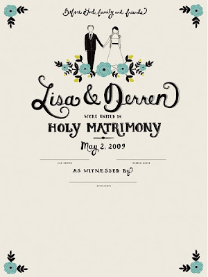
Love is in the Air
Comments Off
Check Out Those Double D’s
Comments Off


One part minimalism + one part brilliance = this awesome pair of salt and pepper shakers. Designed by Antrepo Design Industry in Turkey, these D-cell battery shaped shakers are so smart and simple. [via Lovely Package]|DBK
Twita@talinkahashify your tweets
Comments Off
Well hello everyone. I had previously tweeted about this a few weeks ago… but sometimes I forget more folks follow this blog than my Twitter.
If any of you use our Twitter API to embed your latest statuses on your website, here is a simple little script that will do a few niceties for you. This includes linkafying, hashtagifying, and of course the most important, atify (aka: “at replies”).
Hit the jump to find out more on how to use it.
40 Cute Free Twitter Graphics: Badges, Icons & Buttons…
Comments Off
We’ve put together this free set of unique twitter graphics. Simply drag and drop the various graphics, icons, badges and buttons into your work free of charge. There really is no limit to what you can do with this brilliant set, lovingly designed by Pasquale D’Silva
Follow us on Twitter
If you enjoy the free set make sure you follow us both on Twitter: Follow me (Liam) @liammckay or @darkmotion (Pasquale) on Twitter!
Preview of the Set
The set includes 40 Files in total, all in Transparent .png format. The buttons etc come with PSD files too so you can edit and re-size them as needed. The original characters come as a large High Res image which makes it very easy to scale down and use however you want. We’ve included many size variations for you, and everything from badges, to silhouette so hopefully it should be as easy as possible for you to use them.
![]()
Download the Set
The full set comes in a .zip containing all of the graphics, which we’ve nicely organized. If you are going to share the set make sure you do so my sharing the Post URL, so in other words don’t link directly to the file. If you are using the set for your design work a link back is not required, but always appreciated.
Download Full Set | 5.5 MB | .ZIP
Special Thanks to Pasquale
Pasquale D’Silva is the artist behind the twitter bird characters. I’ve worked with Pasquale to bring you many free characters in the past and each time he’s injected a lot of fun and charm into the designs. He’s a fantastic guy with a great humor and a raw talent for this sort of thing. So if you’re ever in need of some character design work be sure to get in touch:
Pasquale’s Blog
Darkmotion is the Blog he runs, very entertaining.
Pasquale’s Portfolio
Portfolio of selected works & animations.
Pasquale on Flickr
Flickr is where he keeps photos, sketches etc
Pasquale on Twitter
@darkmotion is his Twitter
Straight Type
Comments Off

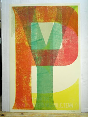
Type, 26 x 40
I just really like this poster by Hatch Show Print, one of the oldest working letterpress print shops in America.|DBK
The “Milton Glaser: To Inform & Delight” Giveaway
Comments Off
I am incredibly excited to announce that the amazing people of Arthouse Films have given me the opportunity to give away two copies of the poster for their new documentary “Milton Glaser: To Inform & Delight” (pictured below) along with a copy of Mr. Glaser’s book “Drawing is Thinking.”
Milton Glaser is without a doubt a design legend, and I am sure that Arthouse Films have created a wonderful movie to showcase his talent. The film premiers on May 22nd in New York City (order tickets here) and on June 19th in San Francisco, so if you live in either of these areas I would highly suggest that you attend.
Official Film Synopsis
For many, Milton Glaser is the personification of American graphic design. Best known for co-founding New York Magazine and the enduring I ♥ NY campaign, the full breadth of Glaser’s remarkable artistic output is revealed in this documentary portrait, MILTON GLASER: TO INFORM AND DELIGHT. From newspapers and magazine designs, to interior spaces, logos, and brand identities, to his celebrated prints, drawings, posters and paintings, the documentary offers audiences a much richer appreciation for one of the great modern renaissance men.
Artfully directed by first time filmmaker Wendy Keys, the film glances into everyday moments of Glaser’s personal life and captures his immense warmth and humanity, and the boundless depth of his intelligence and creativity.
The Giveaway & Entering to Win

Entering is dead simple, just fill out the form directly below to register. Filling out the form will add you to the new Zinni Design email newsletter, which will be sent out no more than 3 times per year. After filling out the form you will receive and email asking you to confirm your subscription. You must confirm your subscription in order to be eligible. No purchase is necessary to win, however you must be a US resident over the age of 18 to enter. You may unsubscribe at any time after the contest has ended.
3 Winners will be randomly selected (2 posters, 1 book) on May 25th 2009 and notified by email to obtain mailing information. All winners will be announced on this page after they have been notified.
Good luck All!


