This is a very simple tip for the Illustrator user interface to center your artboard on your screen. It’s marked “101″ for a reason…
Illustrator 101: Center Artboard from Jay Hilgert on Vimeo.
Industry News – Hosting, PHP and website creation.
0 comments
Illustrator 101: Center Artboard from Jay Hilgert on Vimeo.
0 comments

0 comments
Lead developer for WordPress core and WordPress security expert Mark Jaquith’s presentation on Theme & Plugin Security from WordCamp Phoenix 2011 is a must-watch video for all Theme Developers. Check it out.
0 comments
Latest reports on iAds tell us that Apple recently slashed the minimum ad buy for an iAd from $1 million to $500,000 in an attempt to make the platform more appealing to advertisers. What exactly does this mean for Apple’s iAds? Are they hurting that
badly? Is this a move to attract advertisers in lieu of the new iPad 2
release this week? Several explanations exist and there’s much
speculation as to how well iAds are actually working.
Apple rolled out iAds in April 2010, with the goal of reinventing mobile advertising and creating “branded experiences” over the cheap standard mobile ads. With Apple selling and hosting the ads, developers getting 60% of the revenue, and an initial ad spend of $1 million per advertiser, developers quickly jumped on board to get these ad slots. Steve Jobs sold over 60 million dollar iAd buys to ad execs, touting that iAds would be unlike any mobile ad you’ve ever seen before. In a typical mobile ad, users are directed away from the current application they’re using. In an iAds users stay within the same app, creating a better user experience. Additionally, iAds are rendered in HTML5. Jobs’ presentation of the Toy Story iAd was fully interactive following suit of a native app.
2010′s boom of iAds, however, is now coming to a halt. Fill rates (the portion of ad inventory being bought by advertisers) is falling fast for iAds, while competitor mobile ad networks like AdMob continue to fill much higher rates. But fill rates aren’t the only factors to consider. In app developer Hung Truong’s case, despite the lower fill rate (only 15% compared to AdMob’s 88%), iAds resulted in a higher revenue, due to the more than double click-through-rate that iAds were driving (0.81% compared to AdMob’s 0.25%).
TechCrunch points out other reasons why iAds are “hurting” including seasonality, the shift in sales and relationship management from Steve Jobs to junior account managers, confusing pricing models, and limited reach (due to the availability only on the iOS platform). However, iAds are working for some. Take, for example, Campbells Soup. According to AdAge, A Nielsen advertising effectiveness study commissioned by Apple and Campbell’s Soups to evaluate the soup brand’s iAd campaign said viewers were twice as likely to recall seeing it, three times as likely to remember the ad message and five times as likely to remember the brand as viewers who saw it on TV. Although there may have been a slight bias since iAd respondents were “recruited within various apps”, Campbell’s director of global advertising, Jennifer Gordon was convinced by the findings.
Unlike TechCrunch, I don’t think resistance is setting in just yet. Apple has already taken a step forward by cutting the ad buy price in half. On top of that, the concern of limited reach will be somewhat quelled by the release of the iPhone onto the Verizon network. But I do think Apple needs to make a couple key changes to it’s model including actively identifying and better surfacing more iAd success stories (such as Dove and Nissan), adjusting the extremely confusing and ridiculously high priced CPMs.
Will the recent price drop, and the introduction of new iPads and iPhones alone be enough to keep Apple’s iAds afloat? Only time will tell.
0 comments

Photo by Moochin Photoman
I’m not the first designer to share Things Organized Neatly.
And I’m sure I won’t be the last.
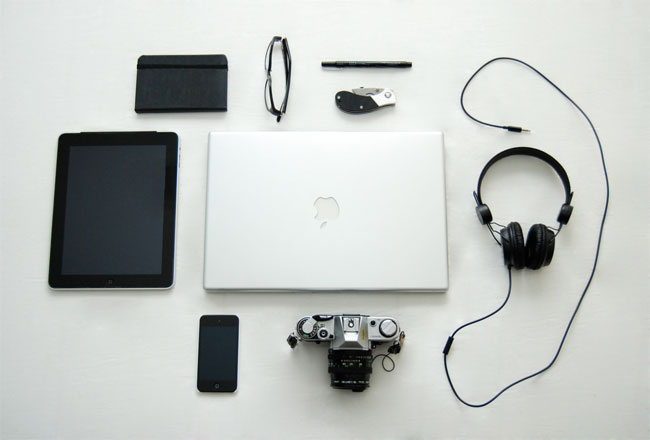


Those are matchsticks, by Claire Fontaine

The contents of a box of Nerds, organised by size
Things Organized Neatly. Via The Crossed Cow.
0 comments
Typotheque was the first commercial type foundry to launch its webfont service. Since its launch in October 2009, it has enjoyed a steady growth. While other services have been trying to catch up, we have been focusing on creating screen optimised fonts to get most of out of our system, while quietly improving the service.
There are over 500 unique websites using Typotheque webfont system, resulting in over 5 million font requests a month. The adoption of the Typotheque webfont service has been fantastic, growing at a double-digit percentage every month.
In the upcoming series of blog entries we will feature some of the sites using our webfont service. If you’d like to present your site too, please drop us a message.

0 comments
Before I dive into this week’s the week in type, I’d like to tell you a little more about Codex, the journal of typography. First, I’d like to introduce the Codex team: the Editor in Chief, Carolyn Wood and Assistant Editor, Allen Tan. It’s a joy to work with them — a mixture of many late nights and hard work with laughter and occasional obsessive-compulsive behavior. It is without a doubt the most incredible, most rewarding project I’ve ever worked on. Working Format in Canada is designing the magazine, and the latest proofs I saw are wonderful. The supporting cast includes H&FJ’s Knockout and Commercial Type’s Lyon, gracing 144 full-color pages. The magazine measures about 8″ by 11″, (approx A4).
We have great authors writing exemplary material for the first issue. For more about the magazine, including its design and contents, be sure to follow @Codex on Twitter and sign up on the Codex website. The full web site, built by Justin Stahl, will be coming soon. And, for all of you who have been so patient, the magazine will be in your hands in April.
And without further ado, please enjoy this week’s week in type.
Love this series of font face posters from the Spanish studio atipo:

LetterMPress is a truly inspired and fun idea.
LetterMpress™ will be a virtual letterpress environment—released first on the iPad—that will allow anyone to create authentic-looking letterpress designs and prints.
For more information, and an opportunity to invest, visit their Kickstarter page.
Suitcase Type Foundry has just released this nice and innovative Type Specimen app for the iPad:

And it’s free.
A lovely teaser or intro by character.fi:
www.character.fi from aleksi hautamäki on Vimeo.
A superb new site. The Case & Point:

The Case & Point is a curated selection of custom type design and lettering created for a specific project or use.
You can follow them on Twitter too, @thecaseandpoint
Nick Sherman made my day when he posted this. Words fail me, but if you could see my smile:

The Noun Project collects, organizes and adds to the highly recognizable symbols that form the world’s visual language, so we may share them in a fun and meaningful way.

Fonts in Use continues to impress. A great piece on Moby Dick, the Arion Press edition.

This isn’t a new project, but one I’ve only just discovered. Bauwelt, a German architectural publication, redesigned by edenspiekermann. It’s just wonderful:

Paul Shaw’s brilliant Overlooked typefaces:

Nice lettering and illustration from Darren Booth:

Discovered a PDF of De Vinne’s The practice of typography: modern methods of book composition (1904). Long out of print, but worth reading. Letterpress printers in particuler will enjoy this one.

Sweet Sans from the incredibly talented Mark van Bronkhorst:

The engraver’s sans serif has been a popular lettering style since around 1900, yet digital interpretations of it have been limited. From antique engraver’s “masterplates,” Mark van Bronkhorst has produced a family that gives the designer a greater range of weights and styles, in both Standard and Pro character sets.
Opula, a new Didone-inspired titling face from Brian Jaramillo:

Yana from Laura Worthington.

Torino Pro, Jason Walcott’s revival of Alessandro Butti’s italic Didone. Swashes and ball terminals aplenty:

Be sure to check out History of the Book’s stream on Flickr. Many new additions, including the magnificent Vesalius woodcuts of 1543:

Looking forward to the publication of Explorations in Typography — Mastering the Art of Fine Typesetting. I’ve pre-ordered mine.

A young and upcoming book designer to keep your eye on: Nina Stössinger. Particularly like this, Das Auge des Wals, a novel by Danish writer Arthur Krasilnikoff:

And Nordlandliebe, a 160-page anthology published by Verlag Martin Wallimann:

Great to see Hrant Papazian’s TMF Patria used to set the texts.
Some great content being posted to WLT. We’ve now reached 10,000 submissions. I can barely keep up:

In search of the font effect.
The lost art of editing.
Designers and Books.
Typedia, Type News: Hwæt-Out.
How to open a new book.
iPad Review: The Daily.
Graphic Content: Carter Sans.
Why The Glass Is Half-Full For Tablet Magazines.
An abbreviated history of books.
John Walters lauds Erik Spiekermann.
An interview with type designer Stefan Hattenbach.
Preliminary program of TYPO Berlin 2011.
The Pilcrow.
Have a great, great week.

Sponsored by H&FJ.
0 comments


Check out the current exclusive resource for our generous donators.

0 comments


